
Chart types
1: There are three main types of charts: line charts, bar charts, and candlestick charts.
2: Line charts only display the closing price of an asset over time.
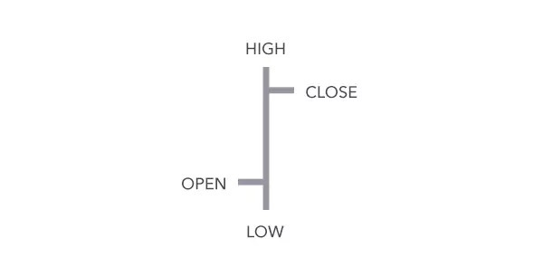
3: Bar charts (HLOC) display the high, low, open, and close prices for each period.
4: The body of a candlestick chart represents the range between the open and close prices, the shadows represent the high/low range, and the color indicates whether the price is rising or falling.
5: A green (or white) body indicates rising prices, while a red (or black) body indicates falling prices.
6: A long candlestick body and short shadows indicate strong buying or selling pressure in one direction.
7: A short candlestick body and long shadows indicate significant buying or selling pressure in one direction, but that pressure subsequently reversed.
We will discuss this tip in more detail in the discussion group. Click on the homepage to access the discussion group.